Looking at Backgrounds Differently
Finding a great background can really transform your picture – but what makes a great background?
You don’t always need flowers and trees, and beautiful scenery – you can find fantastic backgrounds in the most unexpected places. It’s a case of thinking outside the box.
TIPS:
Use a zoom lens and a wide aperture, like F5.6, 4 or 2.8 to throw the background out of focus, which will emphasise and enhance the subject.
The further away the background is from the subject; the more it will be out of focus, on a zoom lens.
Look for texture and colour, things that will blend together when out of focus.
To demonstrate this, I recently did a 50th birthday photo shoot for my friend, Corinne. I chose 3 different locations with backgrounds that had either interesting shape, texture and/or colour.
BACKGROUND 1 – WHITE WALL WITH RAILINGS
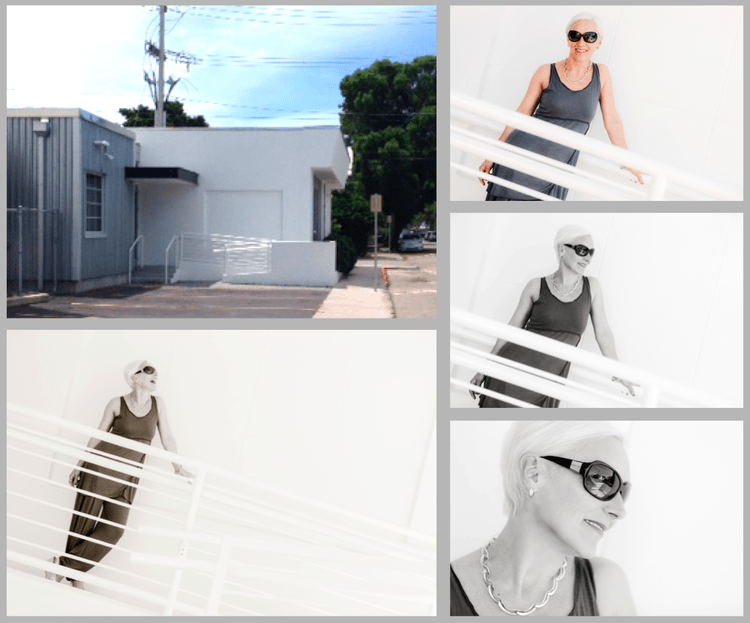
I chose this background for its versatility. The white walls make a great neutral background, but also bounce light around the subject, because they are at the sides and front as well. The railings really add dimension to what could have been quite a boring background otherwise.
As you can see in the “scene” image below – there is a lot of potential for different shots here. First I try some shots leaning Corinne on the rail (above) and then use the shape of the railings to enhance her lovely figure. She almost looks like she’s on a cruise ship! It’s a question of cropping out the bits you don’t want, and angling the camera to make the shots more effective.
Above: Corinne is standing inside the large white square behind the railings – see top left scene shot.
Next I use another area of the white walls, and add a top to her outfit to change the look slightly.
Tip: It’s useful when working on location to use layers of clothing to make your shots look different, without having to ask the model to strip off in the street!
Above: I am standing with my back to the door under the porch roof, whilst Corinne is sitting on the floor inside the white corner piece that joins the roadside.
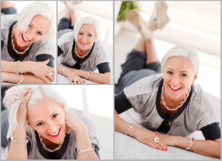
And finally, I ask her to lie down on the ramp, which goes down from the front door to the white corner piece, to create a different set of shots (see below).
Note: I’ve gradually led her into this – she would not want to lie down on a concrete floor at the beginning of the shoot – but once she is enjoying herself and starting to relax she’s more likely to do what I want!
BACKGROUND 2 – TIN GARAGE
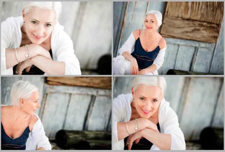
Next, we change clothes and use this wonderful tin garage, with it’s rusty metal texture and colours.
Below – check out the scene shot which shows the rusty garage, and the opportunity for interesting backgrounds.
Above: These shots were taken against the side of the garage under the big tree (top right) – but on the actual shoot day, the sun was in a different position and the tree provided good top shade.
Tip: Angle your camera by tilting it slightly to the left, which allows the lines to slant in the picture and give the image more impact than if they were upright.
Above: By moving Corinne further away from the background, and zooming in on my 70-200 lens set at F2.8, the background becomes more out of focus creating a different feel from the earlier shots.
BACKGROUND 3 – PEELING PAINT IN DISUSED CONCRETE BUILDING
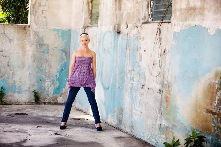
I’m fortunate enough to have this building right on my doorstep, and I dread the day when someone renovates it, because I love the peeling paint and the light in here!
For most of the shoot, Corinne has been dressed in soft, muted colours, and now I decide to change the look for bright funky clothes to complement the gorgeous colours in this building.
Above: Check out local warehouses and disused factories to find textures and peeling paint like these – they make the most amazing backgrounds.
Above: These shots were all taken on the iPhone 5s – the textures and colours just look amazing when you use some of the iPhone effects – it’s great for funky far away shots, but less good for flattering close ups.
Above: The close up shots are much more flattering with a DSLR camera than an iPhone, particularly with a 70-200 zoom lens throwing the background out at F2.8, and slight softening in Lightroom using the clarity slider.
The shots above are taken in the same concrete building, but here I am using the cement floor as a background, by asking Corinne to crouch down while I shoot from above. Shooting from above is much more flattering for close ups, than shooting straight on. I’ve added a leather jacket and messed up her hair to give the shots a different feel.
It’s best to do this towards the end of the shoot, as you’re unlikely to get her hair back to normal if you do it earlier!
Backgrounds with texture and colour like these obviously look amazing in colour, but they are also very effective in black and white. There are lots of places like these around, and you don’t need a whole warehouse – just a patch of rough wall will work really well.
And while I’ve been writing this blog I’ve just been told someone has renovated this building …aaaaaagh! Oh well, let’s look on the bright side – guess it will provide another background!
I hope this encourages you to look differently at what is around you, and find areas which you can use in your photos, with a bit of careful cropping!
Thanks so much to Corinne for letting me use her 50th birthday pictures to illustrate how to see backgrounds differently.
To see more shots taken against my favourite (newly renovated!) background check out: Photographing People who don’t like being Photographed


